History of the Disney Logo Design
By Pam Teel
Walt Disney Studios is one of the most iconic film production companies in the modern age. Every company needs some corporate identity, and more so, a logo to help put its vision and mission in the public domain. Since its creation, Disney Studios, one of the biggest and best animation companies in the world has undergone considerable milestones, not to mention significant transformations on its corpo- rate image to a near perfect logo design – their Cinderella castle symbol, to which many people around the world are accustomed to.
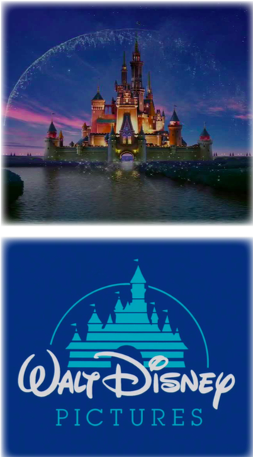
The original Disney logo showed the profile of Mickey Mouse. When animated, as the logo always was in the company’s films and TV shows, the logo would revolve and change colors. It was both a unique design and a testament to the technological advancements in animation that Disney was making at the time. In 1995, though, the logo underwent a transformation into what would be the basis for the Disney logo we see today, featuring a light blue castle with the text “Walt Disney Pictures” displayed across it. This logo was used until 2006 when Disney adopted the logo we now see today.
The current Disney logo is incredibly impressive in its detail, displaying Cinderella’s castle in all of its splendor, complete with balconies, towers, windows, and a moat. Yet again, when animated, this logo shows the advances Disney has made in animation and touts the technological capabilities of the compa- ny. The current logo, both animated and unanimated, also serves as an immediately recognizable symbol of Disney and all the wonder that the company has come to represent.
Any serious business without a logo would not go beyond its first quarter of operation. That is the way it is. Why do companies need logos? Of what benefits is it to them? Graphic Design did not start yesterday; neither did it begin ten years ago. It has been part of movie productions since the distant past. Moreover, when it comes to logo design, the two are inseparable entities unless you are talking about something else. There will hardly be any conversation about a graphic design company without the mention of a logo. It is the ultimate brand identity of a company, not to mention learning institutions and agencies.
Disney studios must have invested a fortune in hiring graphic designers to come up with something as
iconic as the Cinderella Castle as their Disney logo. Technically, it is a thoughtful process. Also, regarding
how it plays a part in brand identity, things like color, shapes, form, lines, and canons of logo design have to play a role. For a company that stakes its brand on state-of-the-art graphics, it’s important to have a logo that lives up to their reputation.
Aside from this, though, the design of the Disney logo is meant to convey a sense of wonder and imagination. Castles always evoke a myriad of feelings such as historic epoch or romance, creating wonderful pictures in your mind. When you see the luxurious Cinderella’s castle, you can’t help but wonder what is inside all of those towers and glowing rooms. Through the worlds that they have created, Disney offers a ticket inside, a way to explore realms and possibilities that stretch the mind and put a smile on your face.
The Castle, located inside Disneyland is a welcoming iconic feature into a magical world of things you only see in the movies. It measures up to 189 feet high, and there is a water concrete at the bottom holding an approximated 3.37 million US water gallons. A forced perspective makes the royal blue- roofed structure seem taller than its actual height. It has 27 towers, formerly 29; until 13th and 17th towers were demolished during construction since they could not be seen clearly by the public. Number 10 has a clock, and the 20th tower is the tallest. There are four more turrets that have been added to the Cinderella Castle to make it more panoramic. It features steel construction, even though the public thinks it is marble. The exterior features hardened fibre that has been reinforced with gypsum plaster. The Disney Castle can withstand 110 miles per hour hurricane winds and could remain stable in case of stronger forces of Mother Nature?
By having their logo and the entrance to their theme parks look incredibly similar, the Disney logo is also able to serve as an advertisement for Disne- yland. Since every Disney movie starts with an animation of the logo, people who enter into one of the Disney theme parks feel like they are stepping into a real-life Disney movie. One last design element to note in the current Disney logo is the shooting star that arcs across the castle, which again creates a sense of wonder and conveys a message of wishes coming true. All in all, Disney has managed to create an incredibly popular logo and per- fectly integrated it into their marketing efforts, making the history of the Disney logo a great example to learn from.

